library(limma)
library(Glimma)
library(edgeR)
library(Mus.musculus)21 Differential Gene Expression Analysis
Introduction
Today we will be following along with Law et al. (2018) through their Biodonductor vignette titled RNA-seq analysis is easy as 1-2-3 with limma, Glimma and edgeR. There are some slight differences to how I’ve done things, compared to the vignette, but those changes are mostly cosmetic.
The data we’ll be working with comes from a study of three cell populations from mouse mammary glands (Sheridan et al. 2015). RNA samples were sequenced using Illumina HiSeq 2000, generating 100 base-pair single-end reads. The authors have aligned the data and provided the counts matrix that we’ll be analyzing today.
Data
To start with, load the requisite packages.
Next, we’ll download and extract the files we’ll be analyzing from https://www.ncbi.nlm.nih.gov/geo/download/?acc=GSE63310.
# repository root
root <- here::here()

# data paths
url <- "https://www.ncbi.nlm.nih.gov/geo/download/?acc=GSE63310&format=file"
data <- file.path(root, 'data', 'rna')
tar <- file.path(data, "GSE63310_RAW.tar")

# download and extract tar file
if(!file.exists(tar)) # only download and extract only if needed
{
  utils::download.file(url, destfile=tar, mode="wb")
  utils::untar(tar, exdir = data)

  files <- list.files(data) |>
    grep(pattern = 'GSM', value = TRUE)

  for(f in files)
    R.utils::gunzip(file.path(data, f), overwrite=TRUE)
}

# get names of unzipped files
# for some unexplained reason they only include the the basal, LP and ML samples
# we'll drop the other two
files <- list.files(data) |>
  grep(pattern = 'GSM', value = TRUE) |>
  grep(pattern = 'mo906111', invert = TRUE, value = TRUE) |>
  grep(pattern = 'CDBG', invert = TRUE, value = TRUE)

# check that we have something reasonable
read.delim(file.path(data, files[1]), nrow=5)
EntrezID GeneLength Count
1 497097 3634 1
2 100503874 3259 0
3 100038431 1634 0
4 19888 9747 0
5 20671 3130 1Reading these into R is a simple matter when we use the edgeR package.
counts <- readDGE(files, data, columns = c(1,3))This should give us 9 columns of data (one for each sample) for a bunch of gene identifiers.
dim(counts)[1] 27179 9Sample metadata
Next we’ll update the metadata in counts.
# remove "GSM..._" from the beginning of the sample names
colnames(counts) <- colnames(counts) |>
  gsub(pattern = 'GSM\\d{7}_', replace = '')

# define groups
counts$samples$group <- as.factor(c("LP", "ML", "Basal", "Basal", "ML", "LP",
                                    "Basal", "ML", "LP"))

# define lane (for batch consideration)
counts$samples$lane <- as.factor(rep(c("L004","L006","L008"), c(3,4,2)))

counts$samples
files group lib.size norm.factors lane
10_6_5_11 GSM1545535_10_6_5_11.txt LP 32863052 1 L004
9_6_5_11 GSM1545536_9_6_5_11.txt ML 35335491 1 L004
purep53 GSM1545538_purep53.txt Basal 57160817 1 L004
JMS8-2 GSM1545539_JMS8-2.txt Basal 51368625 1 L006
JMS8-3 GSM1545540_JMS8-3.txt ML 75795034 1 L006
JMS8-4 GSM1545541_JMS8-4.txt LP 60517657 1 L006
JMS8-5 GSM1545542_JMS8-5.txt Basal 55086324 1 L006
JMS9-P7c GSM1545544_JMS9-P7c.txt ML 21311068 1 L008
JMS9-P8c GSM1545545_JMS9-P8c.txt LP 19958838 1 L008Gene metadata
We’ll also want to convert the Entrez IDs into something human readable.
genes <- AnnotationDbi::select(Mus.musculus,
                               keys = rownames(counts),
                               columns = c("SYMBOL", "TXCHROM"),
                               keytype="ENTREZID")
There is a note here that indicates some of our Entrez IDs are being mapped to multiple entries in the Mus.Musculus database. Here are the first few duplicates.
filter(genes, ENTREZID %in% filter(genes, duplicated(ENTREZID))$ENTREZID) |>
    arrange(ENTREZID) |>
    head()
ENTREZID SYMBOL TXCHROM
1 100040048 Ccl27b chr4
2 100040048 Ccl27b chr4_JH584293_random
3 100041102 Pramel42 chr5
4 100041102 Pramel42 chr5_JH584296_random
5 100041102 Pramel42 chr5_JH584297_random
6 100041354 Pramel57 chr5To keep things simple, let’s just keep the first row in each case.
counts$genes <- genes[!duplicated(genes$ENTREZID),]Pre-processing
There are a few steps we still need to take to clean up the data and prepare it for analysis.
Scaling
We don’t typically analyze raw counts. We’ll use log-2 counts per million for our analysis.
lcpm_raw <- cpm(counts, log = TRUE)Filter for low counts
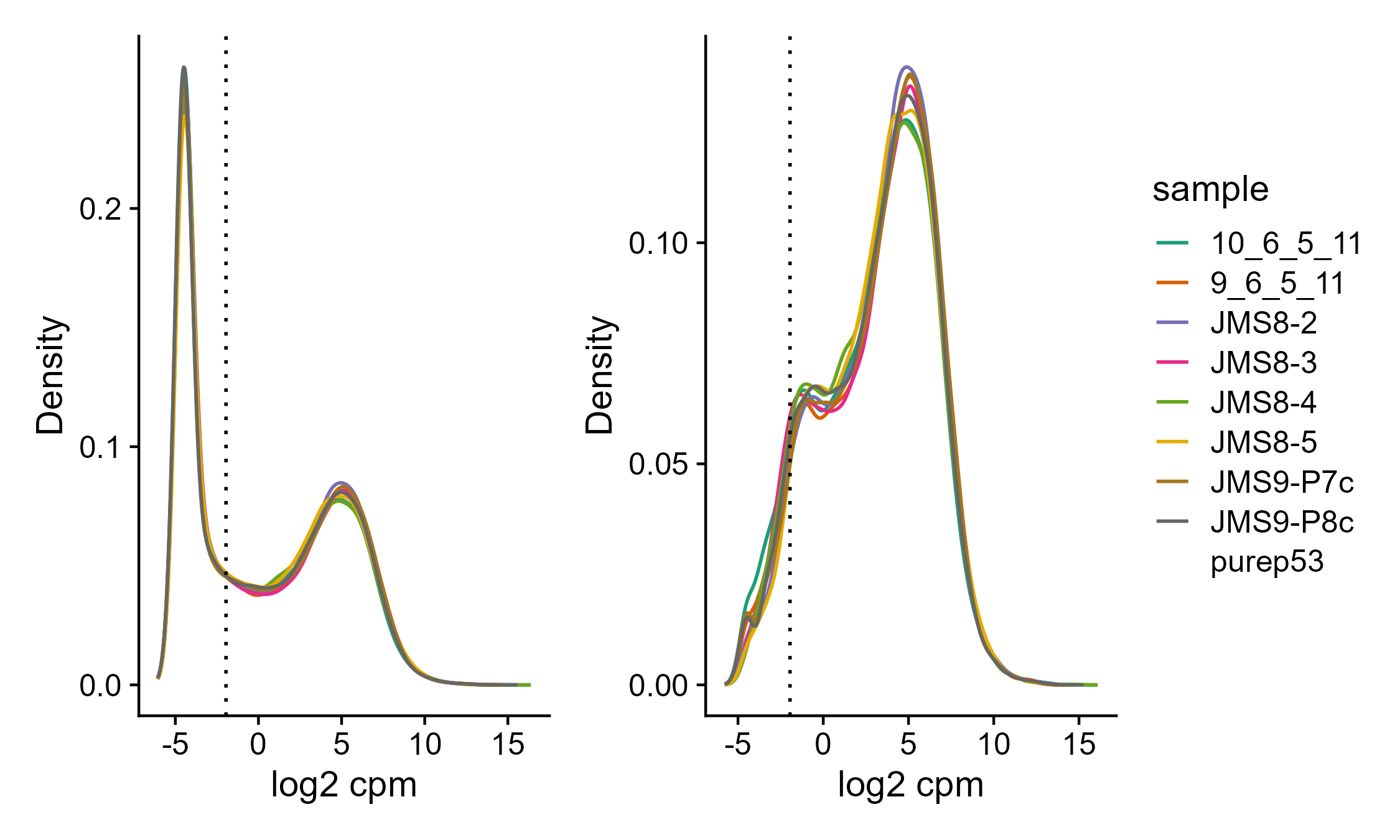
There are 19% of our genes that were not observed across all 9 samples. There are also additional genes with very low counts across all samples. We will start by removing those, as they are not interesting because we don’t have enough statistical power to say anything meaningful about them. We’ll use the defaults in filterByExpr (see ?filterByExpr).
counts_raw <- counts

# the `keep.lib.sizes` argument will recalculate the library sizes
counts <- counts[filterByExpr(counts),,keep.lib.sizes=FALSE]

lcpm <- cpm(counts, log = TRUE)
Code
root <- here::here()
img.out <- file.path(root, 'assets', '06_lcpm_filtering.png')
if(!file.exists(img.out))
{
# these cutoffs are the defaults used by filterByExpr
lcpm.cutoff <- log2(10/(mean(counts_raw$samples$lib.size) * 1e-6) +
                    2/(median(counts_raw$samples$lib.size) * 1e-6))

dens_raw <- map(1:ncol(counts), ~ density(lcpm_raw[,.x]))

g1 <- tibble(sample = rep(rownames(counts$samples),
                    each = length(dens_raw[[1]]$x)),
       `log2 cpm` = map(dens_raw, ~ .x$x) |>
        unlist(),
       Density = map(dens_raw, ~ .x$y) |>
        unlist()) |>

    ggplot(aes(`log2 cpm`, Density, color = sample)) +
    geom_line() +

    geom_vline(xintercept = lcpm.cutoff, linetype=3) +

    scale_color_brewer(palette = "Dark2") +
    theme_cowplot()

dens <- map(1:ncol(counts), ~ density(lcpm[,.x]))

g2 <- tibble(sample = rep(rownames(counts$samples),
                    each = length(dens[[1]]$x)),
       `log2 cpm` = map(dens, ~ .x$x) |>
        unlist(),
       Density = map(dens, ~ .x$y) |>
        unlist()) |>

    ggplot(aes(`log2 cpm`, Density, color = sample)) +
    geom_line() +

    geom_vline(xintercept = lcpm.cutoff, linetype=3) +

    scale_color_brewer(palette = "Dark2") +
    theme_cowplot()

g1 + g2 + plot_layout(guides = 'collect')

ggsave(img.out, width = 7.5, height = 4.5, units = 'in')
}
Normalization
Next, we’ll normalize the data. This is neccessary to account for any bias between samples such as differences in the amount of RNA sequenced.
counts <- calcNormFactors(counts, method = "TMM")
lcpm <- cpm(counts, log=TRUE)
boxplot(lcpm)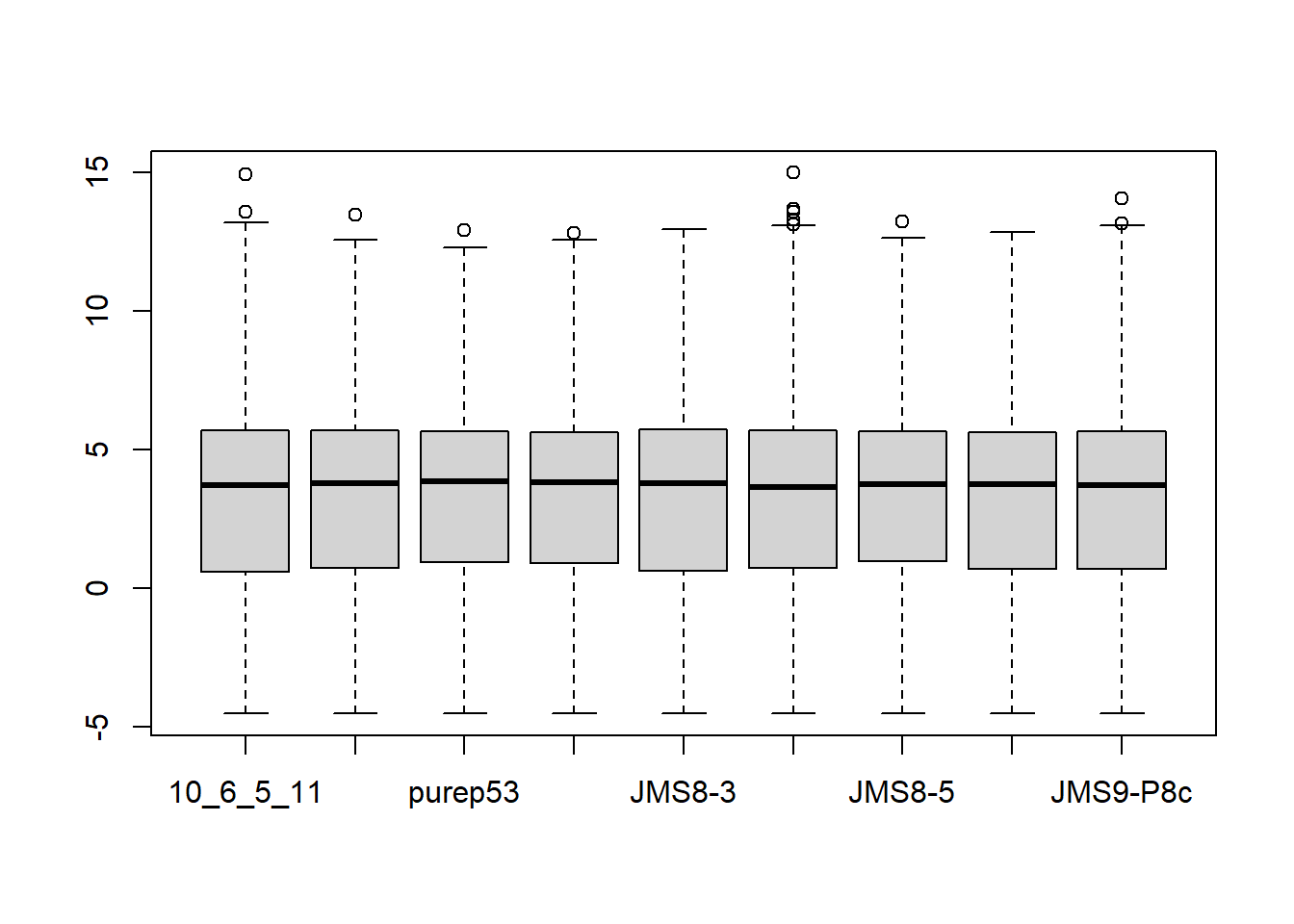
Clustering for QC
Before we run our differential expression analysis, we’ll typically want to double check that things that should be simmilar (e.g. groups) cluster together and things that should not be similar (e.g. lanes) don’t.
# set group colors
col.group <- counts$samples$group
levels(col.group) <-  brewer.pal(nlevels(col.group), "Set1")
col.group <- as.character(col.group)

plotMDS(counts, labels = counts$samples$group,
        col = col.group)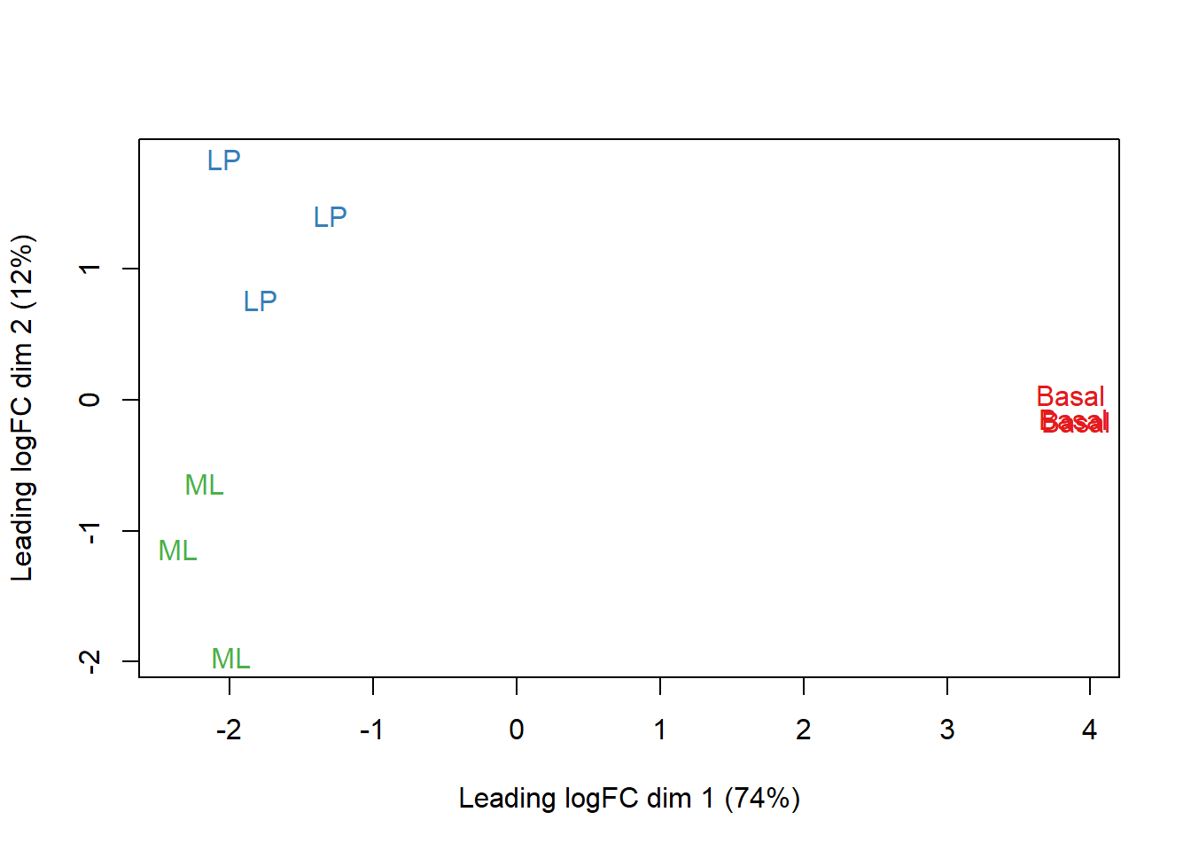
# set lane colors
col.lane <- counts$samples$lane
levels(col.lane) <-  brewer.pal(nlevels(col.lane), "Set2")
col.lane <- as.character(col.lane)

plotMDS(counts, labels = counts$samples$lane,
        col = col.lane)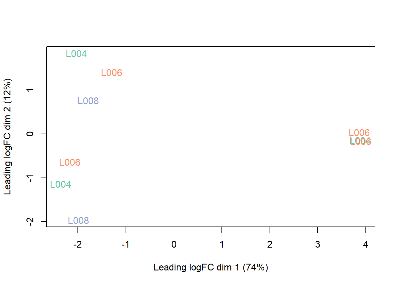
This interactive figure generated by the Glimma package (see code below) is a nice alternative.
glMDSPlot(lcpm, labels=paste(counts$samples$group,
                             counts$samples$lane, sep="_"),
          groups=counts$samples[,c(2,5)], launch=FALSE)

file.rename('glimma-plots', file.path(root, 'assets', '06_glimma-plots'))
Differential Gene Expression Analysis
We’re now ready to perform our differential gene expression analysis.
Design matrix and contrasts
The first step is to define our design matrix and contrasts, which will tell limma what linear model to use. One advantage of limma is that we can be very specific about what comparisons we want to test.
design <- model.matrix(~0 + counts$samples$group + counts$samples$lane)
colnames(design) <- str_replace(colnames(design), fixed('counts$samples$'), '') |>
    str_replace('group', '') |>
    str_replace('lane', '')

contr.matrix <- makeContrasts(
   BasalvsLP = Basal-LP,
   BasalvsML = Basal - ML,
   LPvsML = LP - ML,
   levels = colnames(design))
Linear modeling
One of the major assumptions of the linear models we’ll be using is that the variance of the data is the same across all levels of our count data. When this assumption is voloated, the data are heteroscedastic (i.e. the variance changes as the count size increases).
v <- voom(counts, design, plot = TRUE)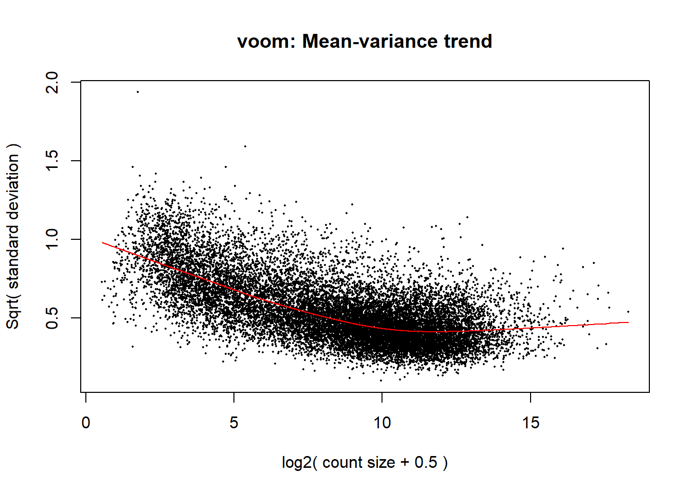
vfit <- lmFit(v, design)
vfit <- contrasts.fit(vfit, contrasts=contr.matrix)
efit <- eBayes(vfit)
plotSA(efit, main="Final model: Mean-variance trend")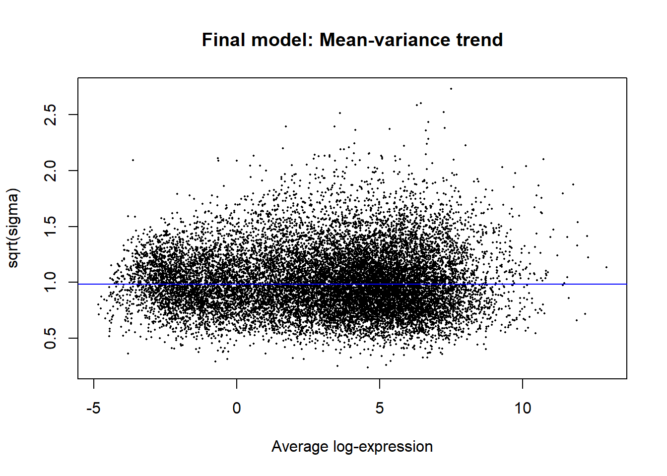
Results exploration
The linear models calculated above using lmFit and contrasts.fit are what we’ll use as the basis of our differential gene expression analysis. We can get a quick summary of the raw results as follows:
summary(decideTests(vfit)) BasalvsLP BasalvsML LPvsML
Down 4648 4927 3135
NotSig 7113 7026 10972
Up 4863 4671 2517This doesn’t take fold-change into account, however. If we want to filter results to include only those that are biologically relevant, we can keep only those that pass a certain fold-change threshold (e.g. > 1).
tfit <- treat(vfit, lfc=1)
dt <- decideTests(tfit)
summary(dt)
BasalvsLP BasalvsML LPvsML
Down 1632 1777 224
NotSig 12976 12790 16210
Up 2016 2057 190A total of 4736 unique genes are differentially expressed using these criteria.
vennDiagram(dt)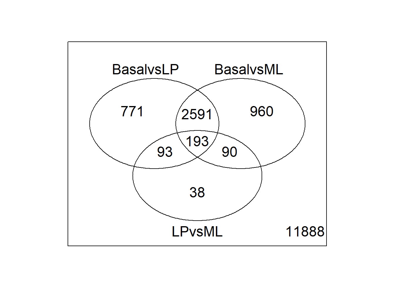
We can examine the top 10 hits in the Basal vs LP comparison using topTreat:
topTreat(tfit, coef = 1, n = 10) ENTREZID SYMBOL TXCHROM logFC AveExpr t P.Value
12759 12759 Clu chr14 -5.455444 8.856581 -33.55508 1.723731e-10
53624 53624 Cldn7 chr11 -5.527356 6.295437 -31.97515 2.576972e-10
242505 242505 Rasef chr4 -5.935249 5.118259 -31.33407 3.081544e-10
67451 67451 Pkp2 chr16 -5.738665 4.419170 -29.85616 4.575686e-10
228543 228543 Rhov chr2 -6.264208 5.485314 -29.07484 5.782844e-10
70350 70350 Basp1 chr15 -6.084738 5.247023 -28.26649 7.267694e-10
19253 19253 Ptpn18 chr1 -5.645839 4.128434 -27.78864 8.270939e-10
14275 14275 Folr1 chr7 -6.918539 3.837486 -27.86847 8.369786e-10
218518 218518 Marveld2 chr13 -5.153194 4.930008 -27.28728 9.497378e-10
12521 12521 Cd82 chr2 -4.120049 7.069637 -26.83704 1.066840e-09
adj.P.Val
12759 1.707586e-06
53624 1.707586e-06
242505 1.707586e-06
67451 1.739242e-06
228543 1.739242e-06
70350 1.739242e-06
19253 1.739242e-06
14275 1.739242e-06
218518 1.754271e-06
12521 1.773514e-06Graphical inspection
We can also visually inspect the Basal vs LP results with plotMD. This will generate a static plot of the up and down regulated genes in a comparison between the two groups.
plotMD(tfit, column=1, status=dt[,1], main=colnames(tfit)[1])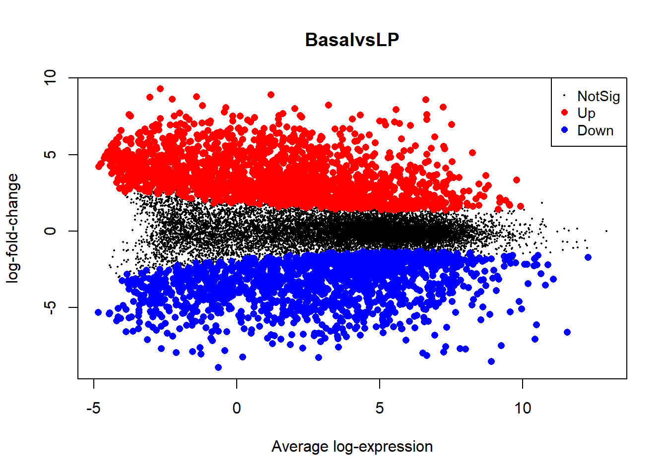
You can also try an interactive plot from the Glimma package that will allow you to view the gene names for each data point:
glMDPlot(tfit, coef=1, status=dt, main=colnames(tfit)[1],
         side.main="ENTREZID", counts=lcpm, groups=counts$samples$group)
A heatmap of the hierarchically clustered data can also help identify interesting relationships. Let’s take a look at the top 100 genes from the comparison of basal vs LP.
require(gplots)
basal.vs.lp.topgenes <- topTreat(tfit, coef = 1, n = Inf)$ENTREZID[1:100]
i <- which(v$genes$ENTREZID %in% basal.vs.lp.topgenes)
mycol <- colorpanel(1000,"blue","white","red")
heatmap.2(lcpm[i,], scale="row",
   labRow=v$genes$SYMBOL[i], labCol=counts$samples$group,
   col=mycol, trace="none", density.info="none",
   margin=c(8,6), lhei=c(2,10), dendrogram="column")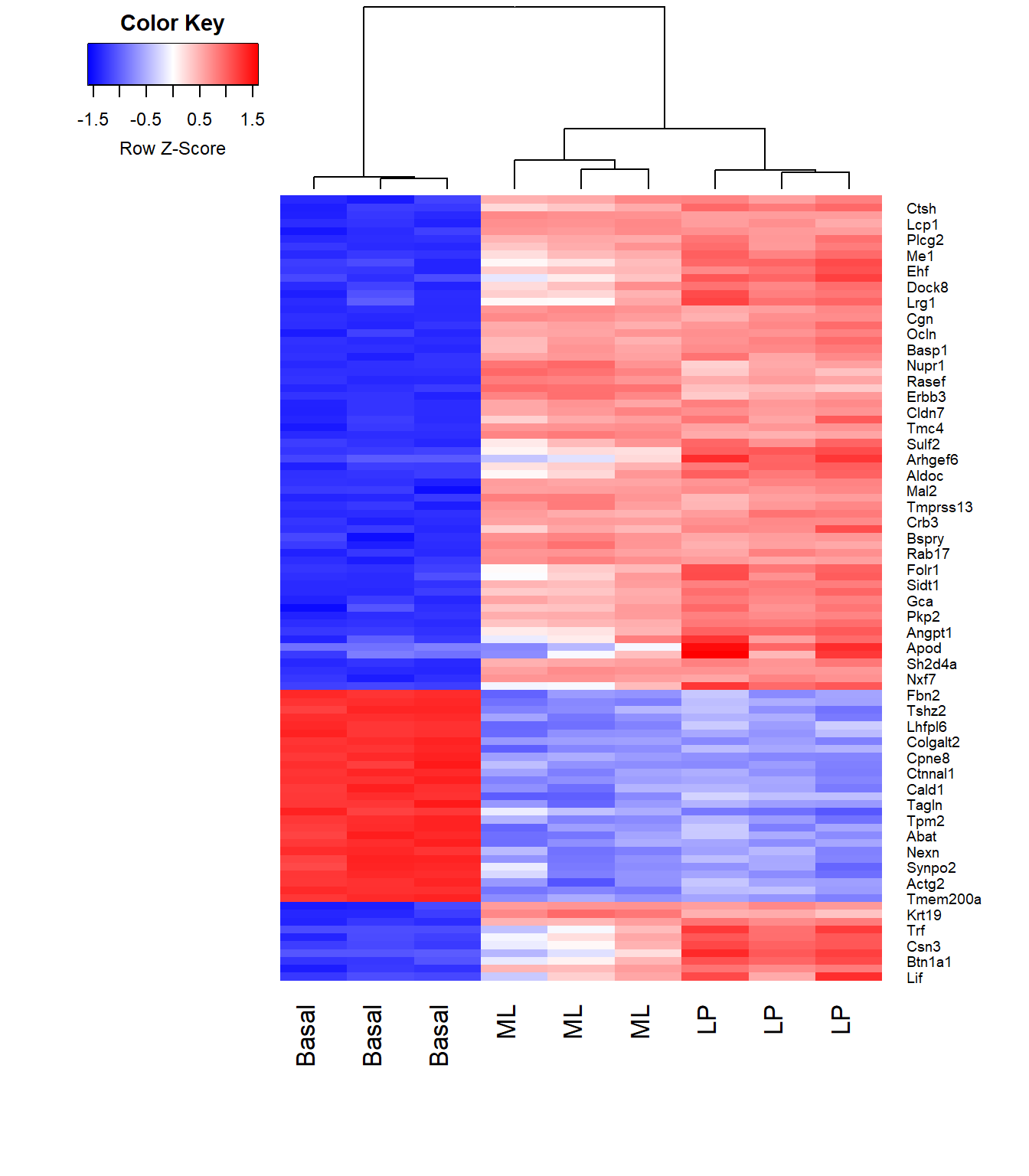
References
Law, Charity, Monther Alhamdoosh, Shian Su, Xueyi Dong, Luyi Tian, Gordon K Smyth, and Matthew E Ritchie. 2018. “RNA-Seq Analysis Is Easy as 1-2-3 with Limma, Glimma and edgeR.” Vignette. RNA-Seq Analysis Is Easy as 1-2-3 with Limma, Glimma and edgeR. https://bioconductor.org/packages/release/workflows/vignettes/RNAseq123/inst/doc/limmaWorkflow.html.
Sheridan, Julie M, Matthew E Ritchie, Sarah A Best, Kun Jiang, Tamara J Beck, François Vaillant, Kevin Liu, et al. 2015. “A Pooled shRNA Screen for Regulators of Primary Mammary Stem and Progenitor Cells Identifies Roles for Asap1 and Prox1.” BMC Cancer 15 (1): 221. https://doi.org/10.1186/s12885-015-1187-z.